
Approlabs
A modern brand system for a modern software partner.
Approlabs is a product development and technology partner specialising in mobile and web apps. We created a modern, minimalist visual brand system that reflects the quality of their engineering.
- Client
- Approlabs
- Industry
- Custom Software Services
- Services
- Visual Identity, Brand System, Web UX/UI

Tags
- Branding
- UX/UI
- Development
The challenge
Software services firms often look alike. Approlabs needed an identity that communicates craft and reliability and stands apart in a crowded market.
Our scope
We developed the visual brand system, including logo, typography, colour, and graphic language, and applied it to their digital presence.
Identity
Clean, confident, and technical.
A minimalist mark and a restrained palette give Approlabs a precise, engineering-led feel, while the graphic language adds enough character to be memorable.
Application
One system, every touchpoint.
Guidelines and assets make the brand easy to apply consistently, from the website to proposals and social channels.
Key solutions
What we delivered.
- /01
Minimalist visual identity
A distinctive mark and type system that communicate quality and precision.
- /02
Flexible brand guidelines
Clear rules and assets for applying the brand consistently.
- /03
Digital-first application
A brand system designed to work across web, product, and social.
More work
Keep exploring.

Good Flows
Unique swipe gestures to drive the next in conversational mobile experiences for AI.
- Conversational AI
- Mobile UX
- Consumer Tech
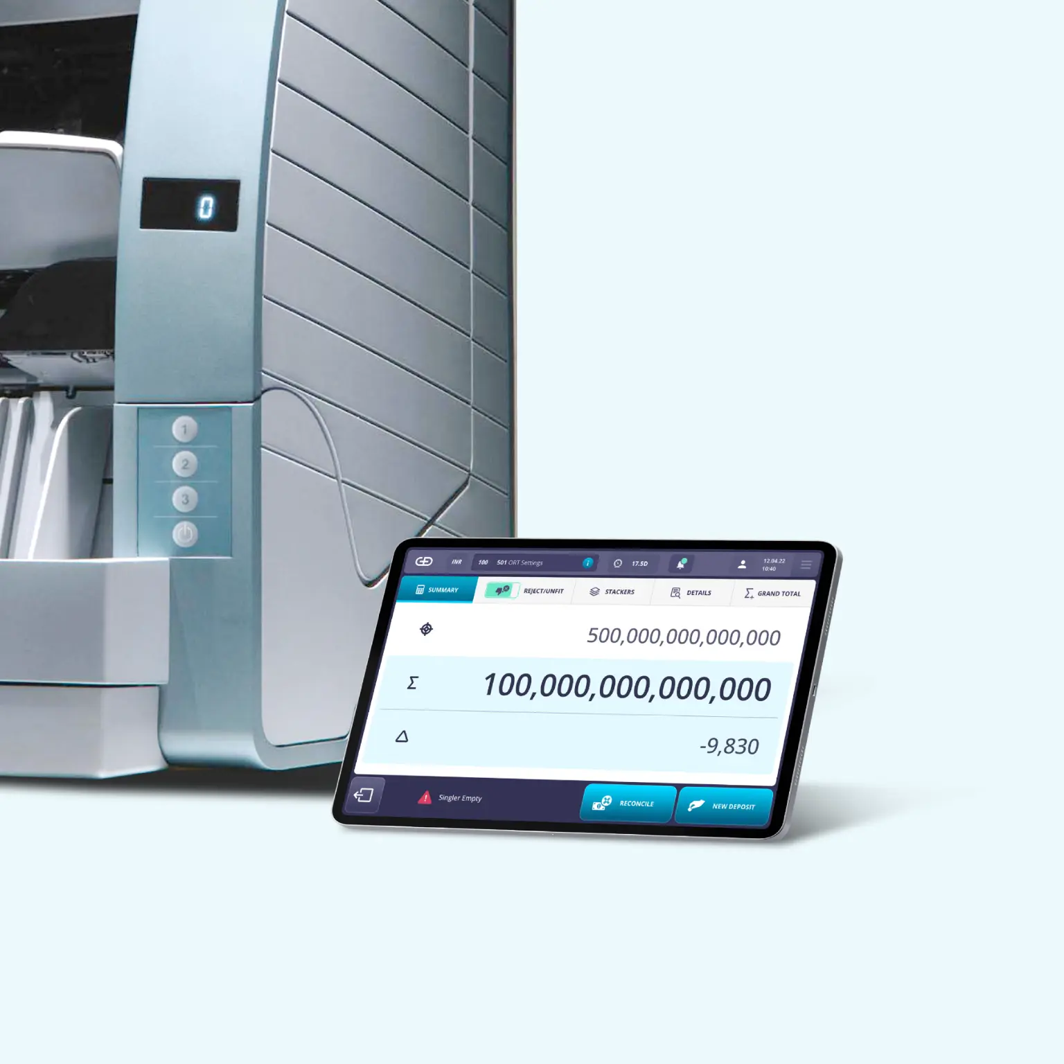
Giesecke + Devrient
Experience research and innovation for the next in cashtech embedded application GUIs.
- Embedded UX
- Branding
- Security Tech

BookMyPooja
A fresh Hindu religious services e-commerce experience for the next in spiritualtech.
- Design for Bharat
- E-commerce UX
- Consumer Tech
Let's talk
Ready to simplify your next?
Tell us what you're building. A founder reads every message and replies within 12 hours.